Connectivity Centric Lifestyle
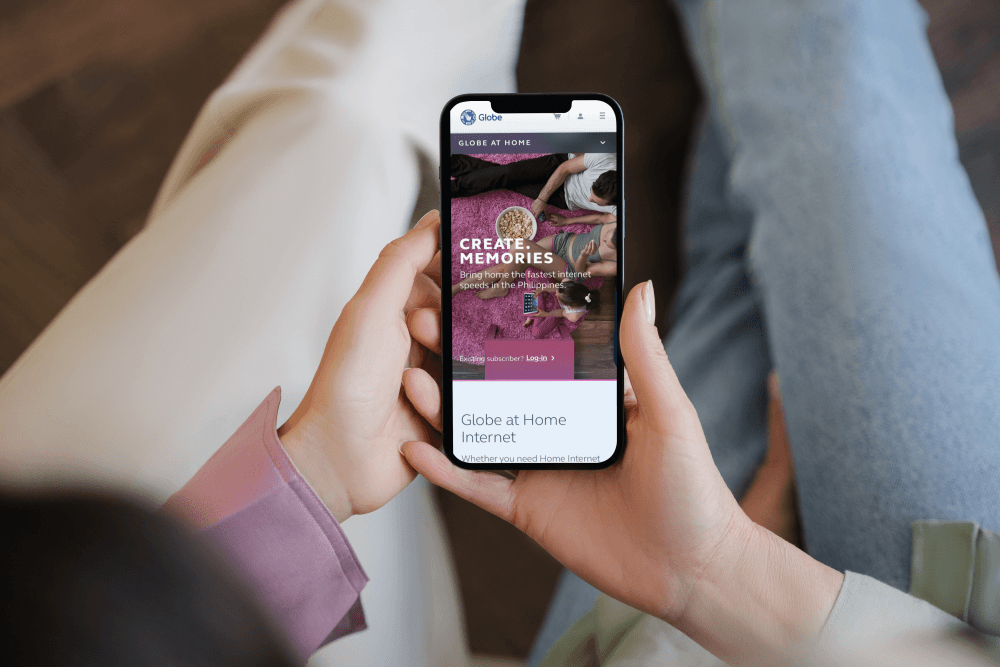
Customer portal experience design for largest broadband and mobile services provider in Philippines. It had market cap of US$3.8 B and 65.8 M+ subscribers but an outdated customer portal, affecting the way customers would buy and manage connectivity services.
Design Direction
Reimagine customer interactions for better engagement, conversions & acquisition
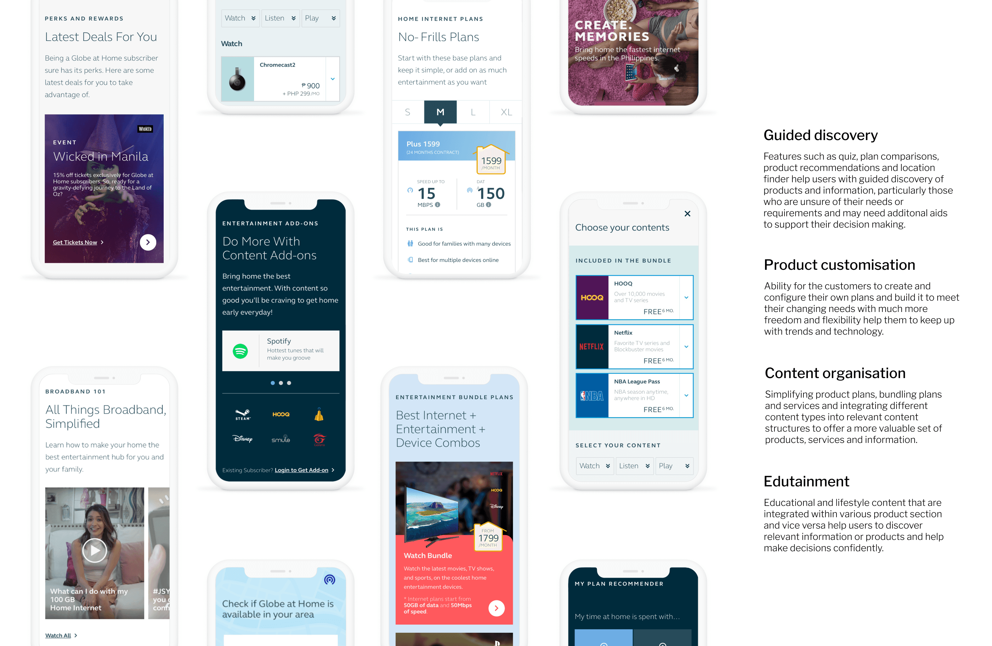
As senior UX consultant, I worked in design sprints to explore, develop and test various ideas for guided discovery, product customization and customer engagement as part of the responsive web solution for customer portal.I managed stakeholders, translated requirements into design artefacts such as flows, wireframes, prototypes, UI and created responsive web solution supporting emerging user behaviors & needs.
Before Solution : Customer's POV
Design Direction
The challenge was to attract younger, aspirational customers and reposition brand as leading lifestyle services provider
Challenge was to effectively reposition fast becoming irrelevant brand given changing socio-economic landscape. Not only it was critical to understand business objectives, but also what customers need and aspire.
I ran sessions to understand diverse perspectives, needs, preferences and built a project charter outlining key goals, scope and measurable impact. Some of the success criteria and KPIs were lower drop-offs, better customer acquisition, increased engagement, improved conversion.
I also conducted secondary research and analyzed web data to understand market influences, cultural preferences and consumer behavior.
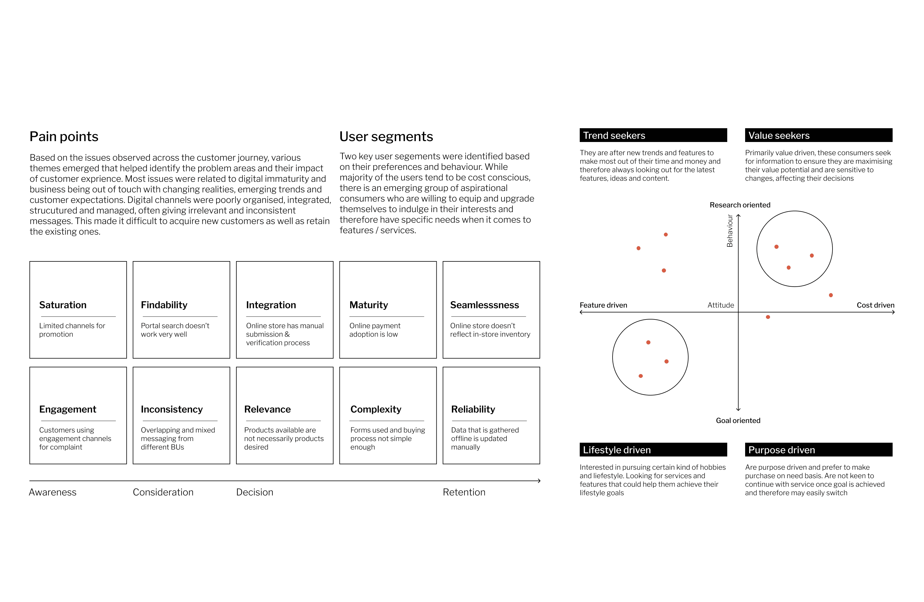
I found that customers were largely cost driven, had a general distrust for corporations and attached great importance to making best buying decisions. Eventually, we came up with personas and journey map to address:
How to emphasise value for money? (cost driven)
How to leverage on emerging trends? (social, aspirational)
How to integrate educational elements in the journey? (social)
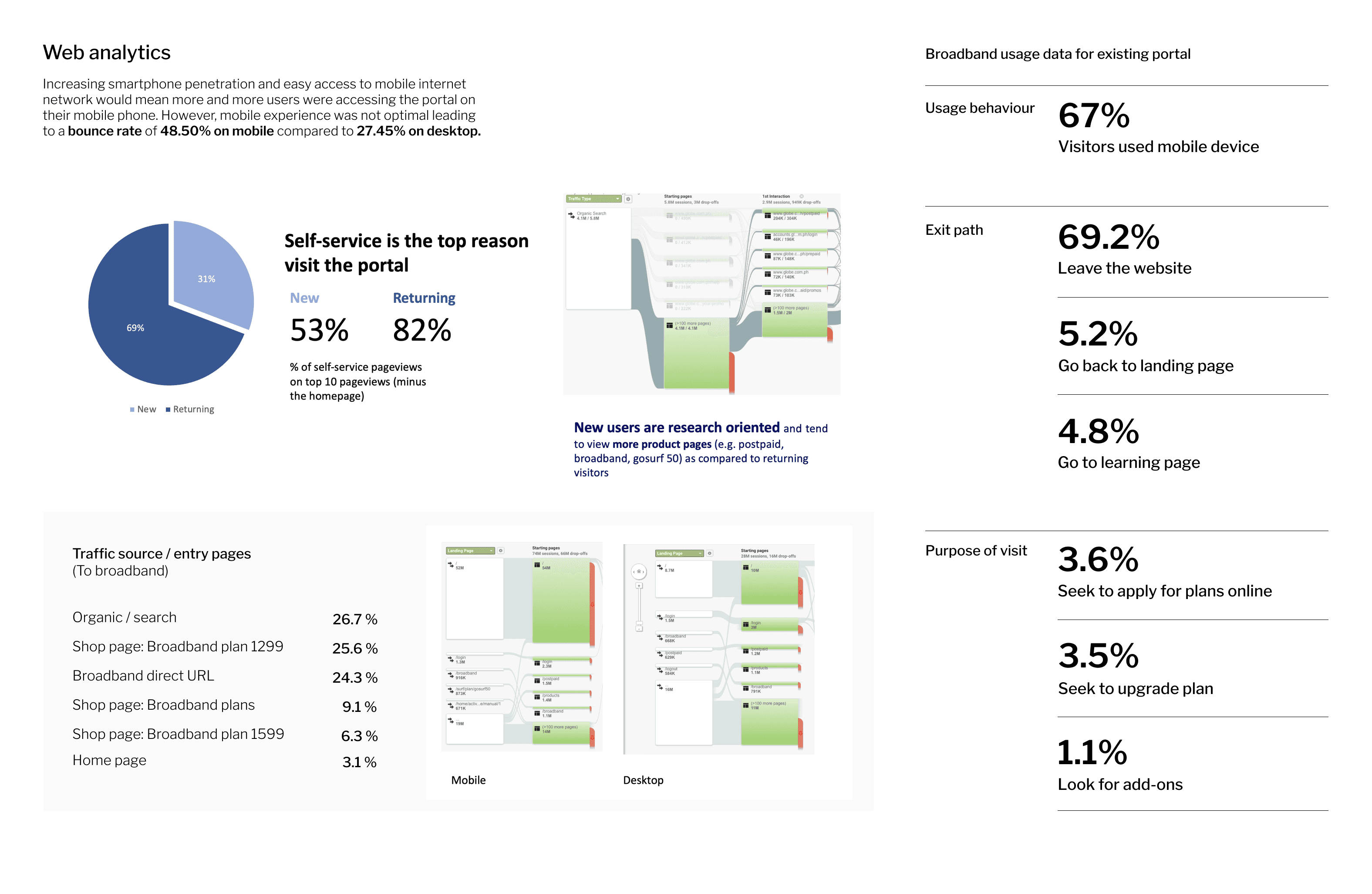
Mobile first
67% of customers accessed site using mobile, however bounce rate was higher than desktop
Hyper social
Filipinos spend 3.5+ hours a day on social media making them hyper acive on social media
Self-service
Portal was primarily being used for managing personal or associated accounts
Problem Statement
How might offer consumers a simplified, empowering and seamless experience by communicating ideas, information and promotions in an engaging, effortless and personalized format?
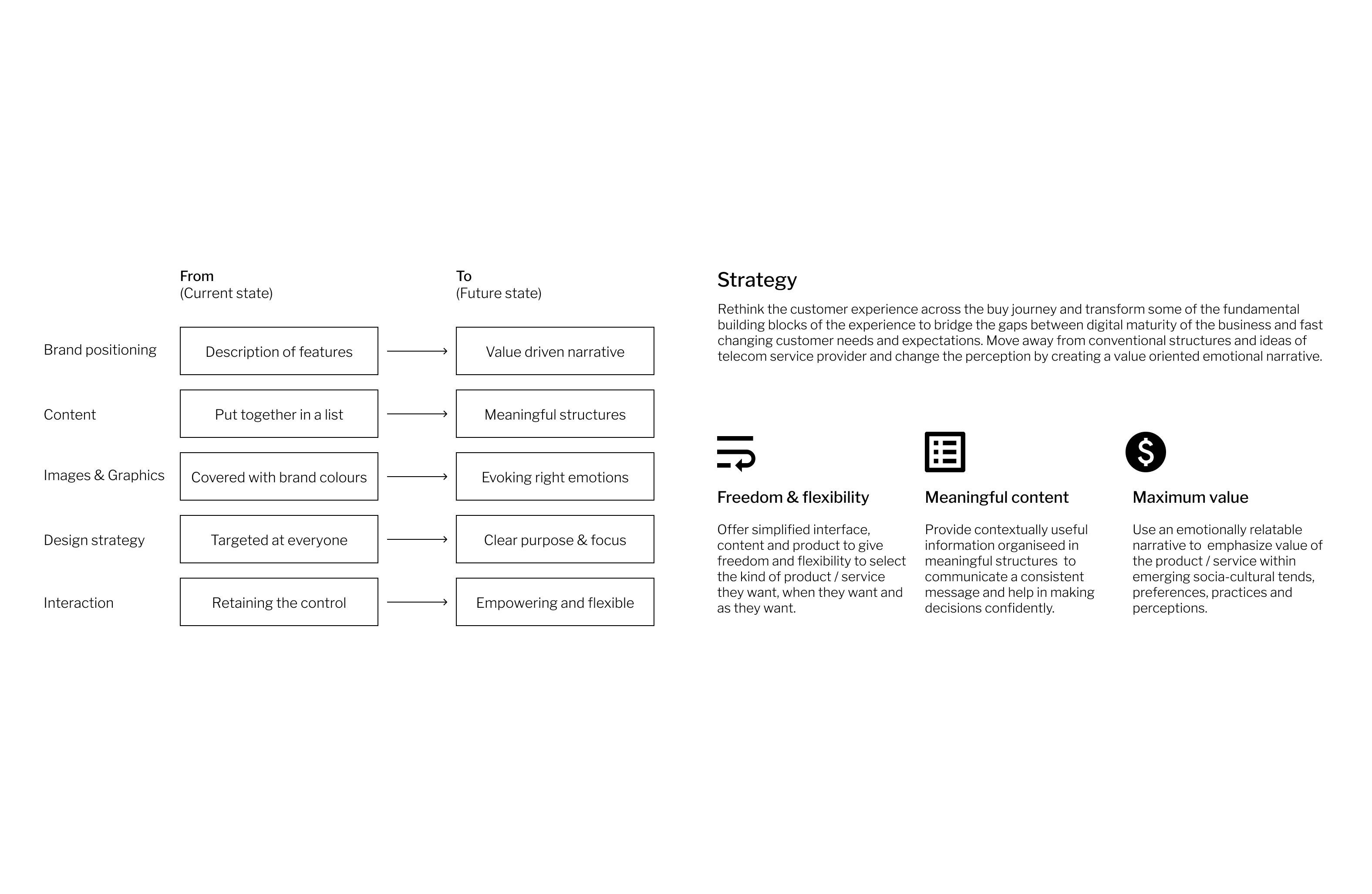
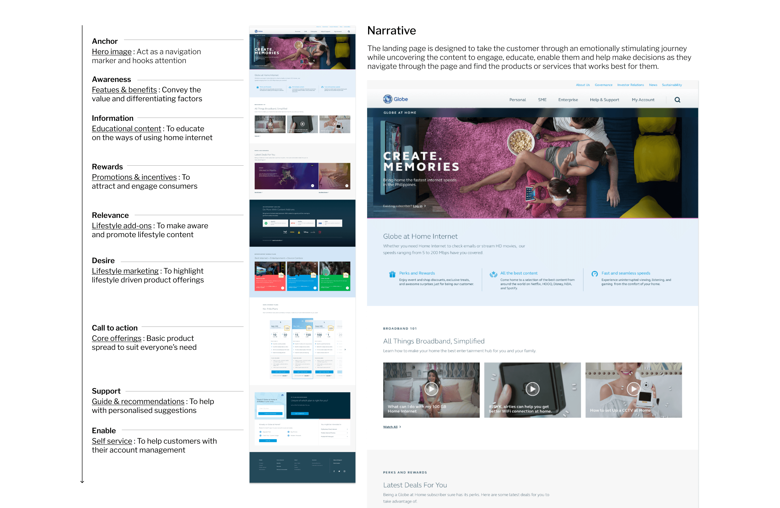
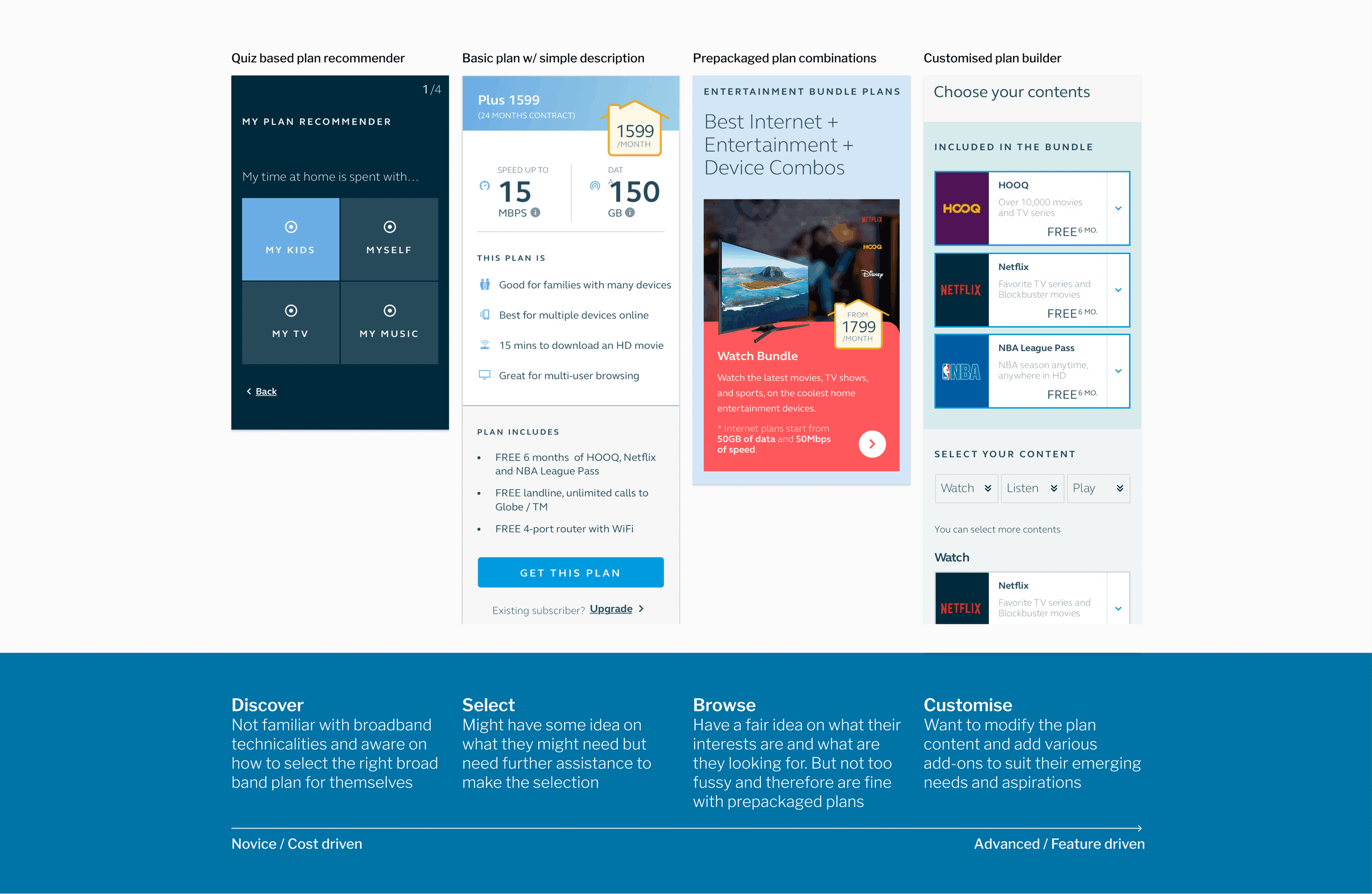
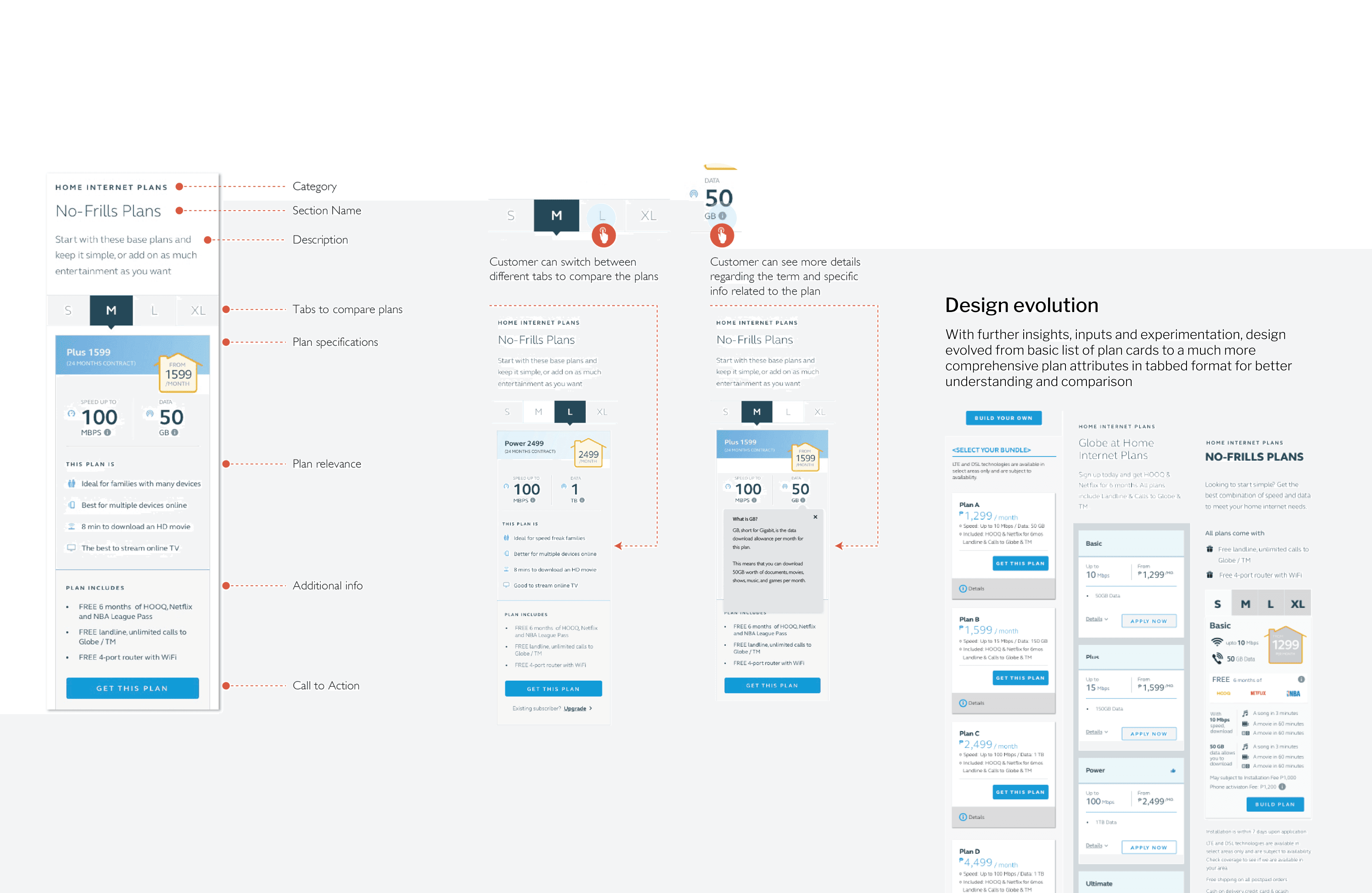
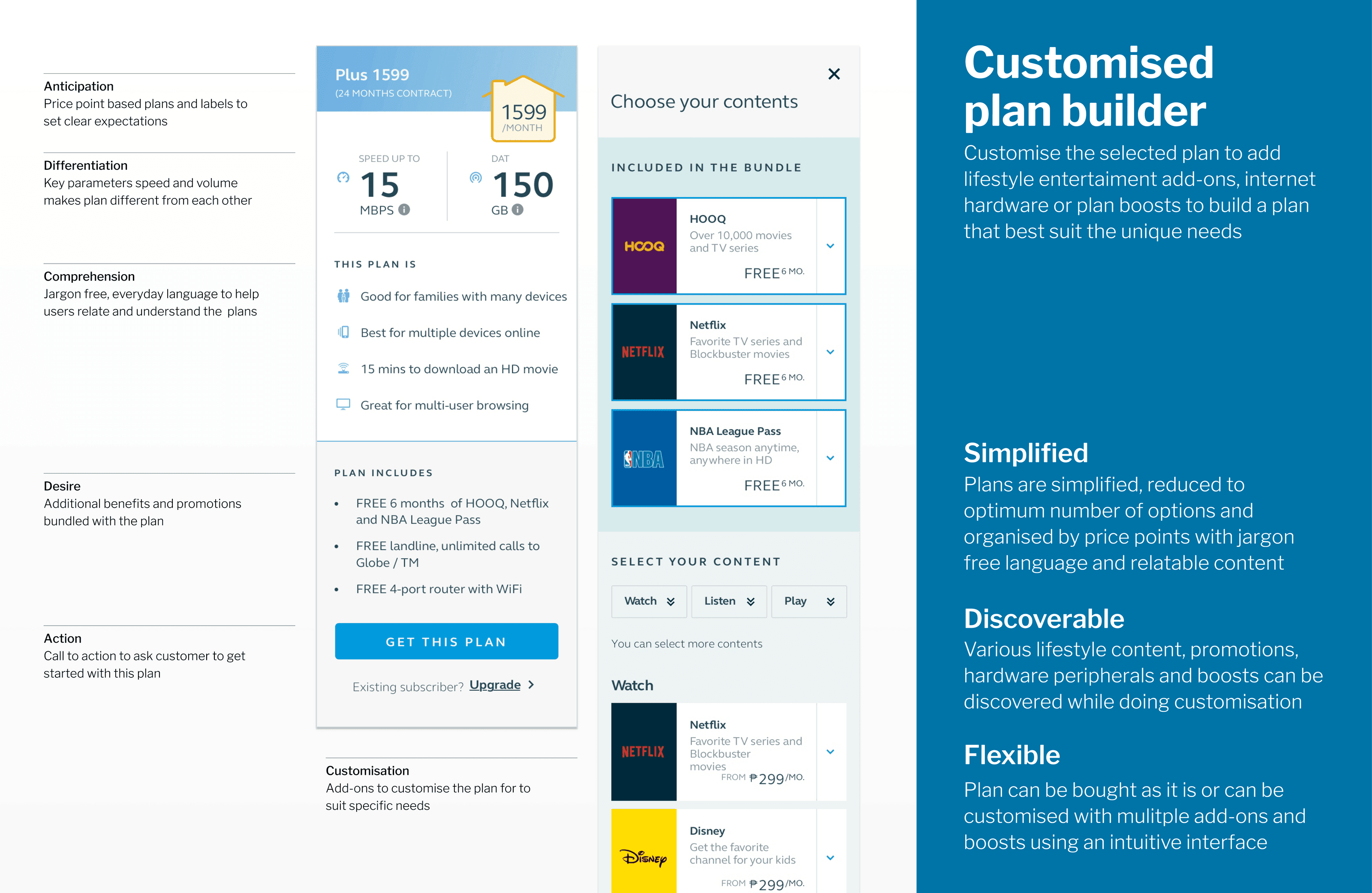
We identified several issues with existing design such as rigid, fragmented workflows and vague information. I helped reframe the problem and we agreed on need for greater structure and simplified, flexible approach across brand positioning, content, design and interactions. We explored number of ideas such as combo plans and plan builder.
We discussed these ideas further and defined user stories for the backlog. I then worked in 3 week sprints to translate these user stories into user flows, wireframes and mock-ups. I also created Axure prototype for sprint demos and usability testing. After several iterations we re-considered the flow on landing pages and re-arranged the order of modules, and incorporated various use cases such as combo, and multiple key criteria that could influence buying decisions.
I prepared research guide with scenarios / tasks and conducted usability test with 8 participants. I identified issues such as:
Lack of educational content
Difficulty in comparing plans
Not so user friendly terminology
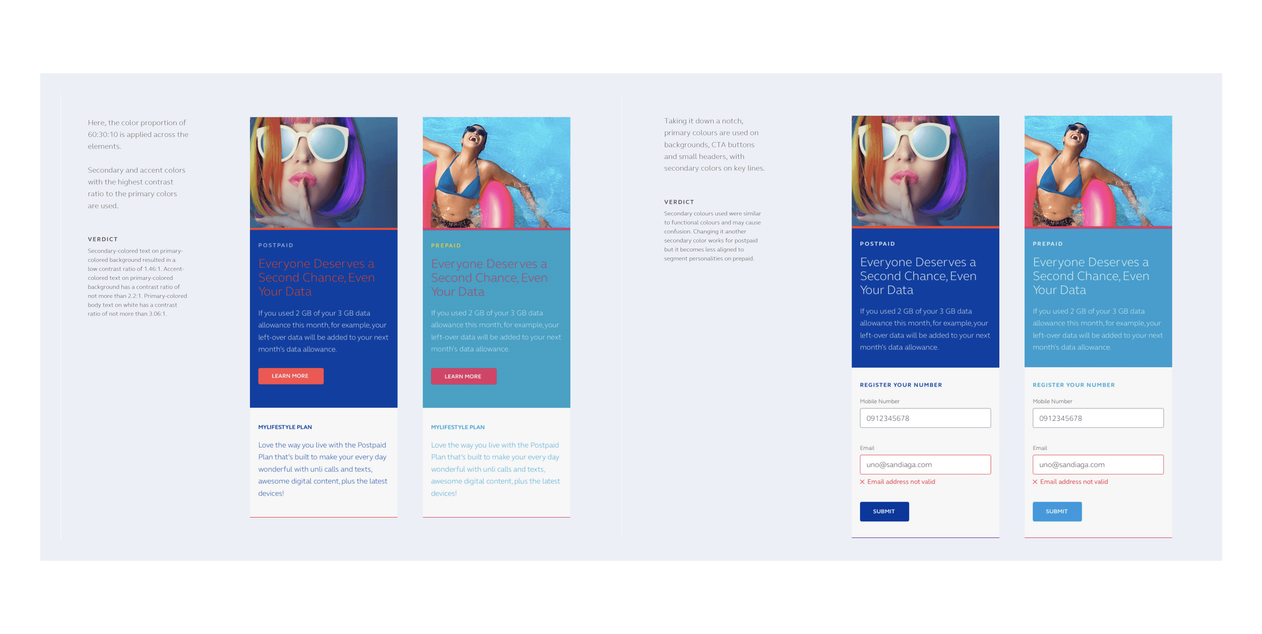
I explored several ideas e.g., instead of listing product plans (which only show one plan at a time) vertically, used tabs to make comparing plans easier. After making the changes we prepared hi-fidelity mock-ups for hand-off.
Usability Test Summary
8
Total number of participants
21 - 35
Participant's age range
4 / 4
Late adopters / Power users
Philippines
Research / test location
The project had some challenges such as large epics considering 3 weeks sprints, remote stakeholders and complex business processes. However, with clear communication, collaboration and early prototyping, we managed to overcome most of the challenges effectively.
Overall, this was a great learning experience and insight into workings of complex telecom business and ever evolving consumer needs.